
-
Projects
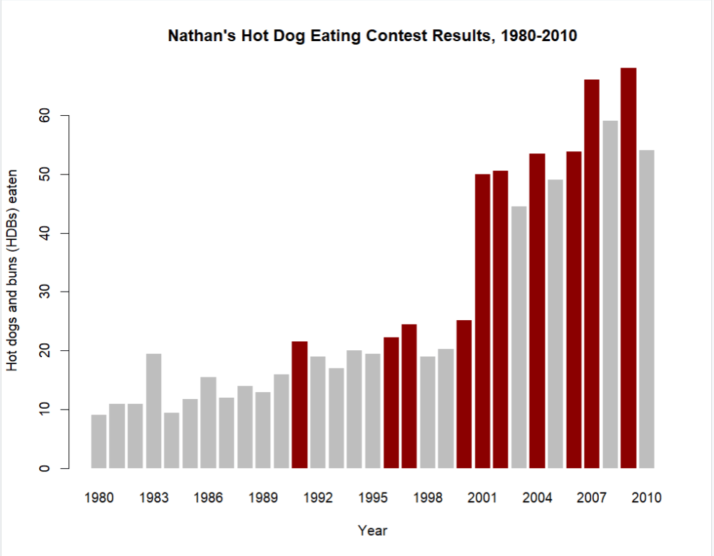
Nathan’s Hot Dog Eating Contest results from 1980–2010. Red bars indicate years a new record was set.
Using ggplot2 makes it easy to highlight years when a new record was set by color coding the bars. Trends become clear, and we can immediately spot exceptional years. Compared to base R graphics, ggplot2 provides cleaner visuals and better customization. This example illustrates the value of visualizing time series data for pattern recognition.
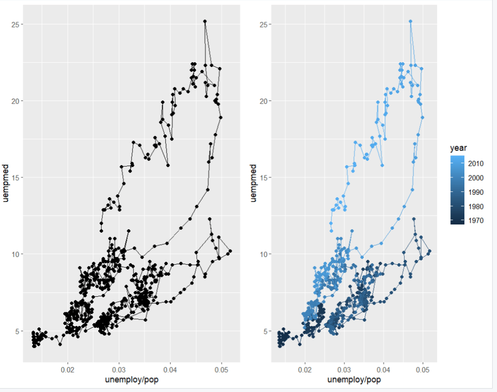
Unemployment vs median duration. Left: points with paths. Right: colored by year to show long-term trends.
These scatter plots reveal trends and relationships over time. We can see how unemployment rates fluctuate and how the median duration of unemployment responds during different periods. Adding color by year makes long term trends immediately visible. Time series visualization is essential for exploring complex relationships and communicating insights.
 Tericia Ricketts